Ready for everything on your iPhone to get a makeover? Ready or not, Apple has shown off exactly what’s changing in terms of design when it brings out the next version of its operating system, now dubbed iOS 26.
Apple hosts several events every year, and this week saw it bring a throng of developers together to share everything that’s changing on the iPhone, as well as its other devices. It’s called the Worldwide Developer Conference, or WWDC, and it’s an annual staple on the tech calendar.
It’s used as a chance for the world to get its first good look at how the devices we carry around every day are going to change. And this year’s changes are pretty dramatic. Here’s what you’ll notice.
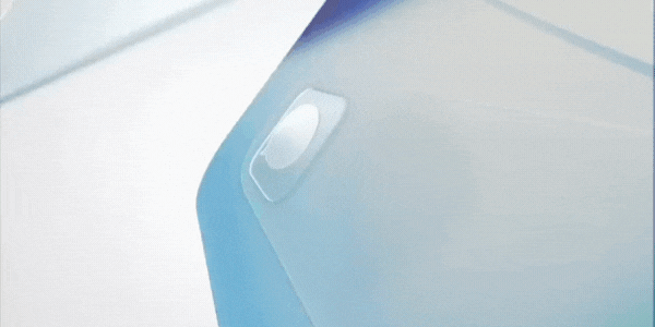
Meet ‘Liquid Glass’
Apple loves to talk about texture. How things look and feel has been a point of pride for the company that brought us everything from the Lisa to the iPod, right through to the latest iPhone and Apple Watch.
Digital textures are also Apple’s specialty. Back when iOS first came out, everything had a tactile texture. The Notes app had a yellow-lined notepad vibe, and even the games centre app had hessian motifs like a bag you’d keep all your dice in. Now it’s getting space-age with its look and feel.
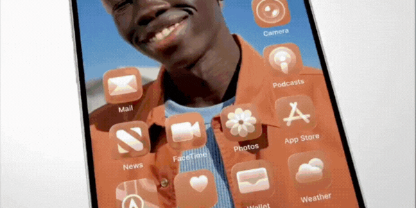
It’s called “Liquid Glass”.
Here’s how Apple describes it:
The new material, Liquid Glass, is translucent and behaves like glass in the real world. Its colour is informed by surrounding content and intelligently adapts between light and dark environments. Born out of a close collaboration between the design and engineering teams, Liquid Glass uses real-time rendering and dynamically reacts to movement with specular highlights. This creates a lively experience that makes using iPhone, iPad, Mac, Apple Watch, and Apple TV even more delightful.This gorgeous new material extends from the smallest elements users interact with every day — like buttons, switches, sliders, text, and media controls — to larger elements, including tab bars and sidebars for navigating apps. It also shines in system experiences, such as the Lock Screen, Home Screen, notifications, Control Centre, and more.
These tweaks are part of a bigger design refresh that touches everything — from the Lock Screen and Home Screen through to even your widgets.
There’s a quiet luxury in the new feel of things. Apple’s designers have obsessed over how controls sit above your content, how they shift when you scroll, and how they fade into the background when you don’t need them. The idea is to put content — your photos, your messages, your music — in the spotlight, and have everything else get out of the way. Not with dramatic animations or gimmicks, but with the kind of restraint that comes from confidence in the design.
Controls and system elements — things like buttons, menus and sliders — now appear as a kind of “glass” layer that floats over your content.
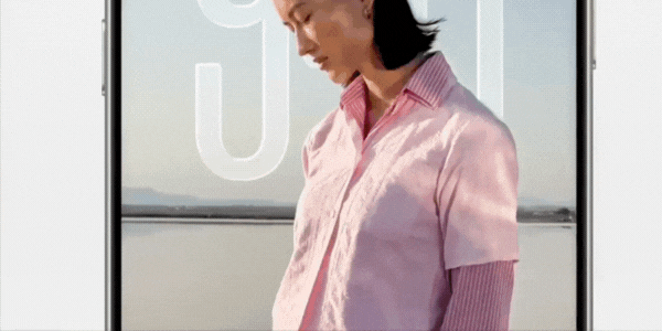
For years, Apple’s software was designed with sharp-edged, rectangular screens in mind. But these days, almost every Apple device has rounded edges. Now, apps follow suit. Toolbars, buttons and other interface elements have been reshaped to mirror the curves of the devices they live on.
Scroll through Apple Music or Photos, and you’ll notice that navigation bars now shrink or expand depending on how you move. It’s a small thing, but it clears space for what you’re actually there to see — your content. And when you scroll back up, your tools reappear without fuss. It feels more natural, less cluttered.
Sidebars have also had a glow-up. In apps like Apple TV, they now gently blur the content behind them and even reflect bits of your wallpaper, so you always have a sense of where you are on-screen. It’s subtle, but it adds to that feeling of depth and continuity.
It won’t make headlines like a brand-new iPhone might. But it does something more subtle. It reminds you that Apple still sweats the details — and that, maybe, is the most Apple thing of all.
Do investors like it?

Of course, the world’s social timelines lit up this week with everyone’s take on the new design, but the market got to weigh in as well.
Thankfully for the Apple executive team, the graph trended green following the keynote presentation.
Apple shares gained almost half a percentage point in the session, tipping almost US$203 per share as more investors piled into the stock. Although, this was on a day where the NASDAQ it trades on was up by two-thirds of a percentage point. Either way, a positive uptick is a good thing, especially when you consider Apple’s share price for the year isn’t looking so hot overall.
The company is down 18.5% in 2025 overall, as cracks start to appear in Apple’s AI plans.