If you’re reading Switzer, you love a good chart. So, how much fuel does Australia have left? Let’s see what we can find in this new tool.
It’s called the the NZOilWatch dashboard. Don’t be confused by the name, it covers Australia too (just flick the toggle in the top right).
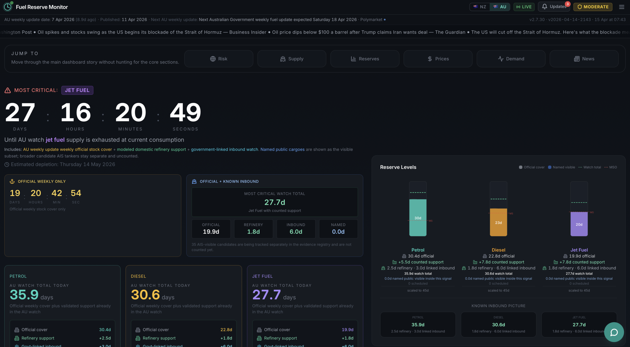
The site gives you a slick, live countdown of how many days of fuel Australia has left, split across petrol, diesel, and jet fuel. It then layers in the tankers currently on the water heading our way, scenario projections tied to the official Australian fuel emergency framework, live pump prices, cross-market data, and a geopolitical risk read on the Strait of Hormuz.
The current anchor, set by Energy Minister Chris Bowen on 11 April using 7 April stock data, puts Australia at 38 days of petrol, 31 days of diesel, and 28 days of jet fuel, with 57 tankers on the water nationally. Those are the numbers the dashboard burns down in real time, hour by hour, applying day-of-week consumption weightings and crediting confirmed vessel arrivals back in as they dock.
Australia burns through roughly 160.8 million litres of fuel every day. Petrol accounts for 43.2 million litres of that, diesel 90 million, and jet fuel 27.6 million. When you look at those consumption rates against the reserve figures, you start to understand why a dashboard like this exists.
Especially considering the consequences if Australia actually does run out of fuel.
Where does it get its data?
The dashboard draws from a stack of public sources, each serving a different layer of the picture:
- Australian Government weekly fuel update — the official stock-cover anchor, published by DCCEEW and cross-referenced against the Energy Minister’s weekly statements. The current anchor is the 7 April 2026 stock set, published 11 April.
- DCCEEW Minimum Stockholding Obligation (MSO) pages — used as context and cross-check against the weekly government update.
- Polymarket Gamma API — prediction market odds on Strait of Hormuz shipping recovery, polled every 30 minutes. These cover markets including the probability of more normal Hormuz traffic by end of April and end of May, US military action odds, and daily ship-count thresholds.
- OilPriceAPI — live Brent crude pricing, updated every five minutes, with Yahoo Finance and Investing.com as fallbacks.
- Petrolmate — Australian national average retail fuel prices, cross-checked against ACCC monitoring.
- Supabase-backed vessel evidence registry — a shared registry of AIS-visible tanker candidates with destination, ETA, and confidence ratings. These appear on the map but are kept out of the supply countdown unless corroborated with named cargo and destination evidence.
- FuelSecurity Australia tanker API — used as a comparison-only corroboration layer, not as a primary source.
- FearGreedMeter — both equity and crypto fear-and-greed readings, updated live.
- EODHD — cross-market equity data covering SPY, QQQ, GLD, XLE, BNO, JETS, tanker stocks including Scorpio Tankers, and airline stocks including United Airlines.
- ArcGIS — the basemap powering the live vessel map.
- News feeds — ABC News, SBS News, Sky News Australia, The Australian, Bloomberg, Reuters, and Argus Media for the Australian crisis feed.
Is it accurate?
That depends on what you mean by “accurate”.
The reserve figures come from a legitimate official source. The MSO data is a legal reporting obligation, not a modelled estimate. The dashboard is transparent that its historical trend chart is a modelled reconstruction rather than a line of daily official observations, and it separates what it calls “actual” (anchored to the latest government snapshot) from what is modelled in between releases.
The vessel tracking layer is worth understanding carefully. The dashboard is explicit that vessel positions are modelled from known routes, published pipeline windows, and public shipping context, not a paid live AIS feed. Tanker candidates appear on the map but are not counted into the reserve figures unless they can be corroborated with named cargo and destination evidence. That is an honest design choice, and it means the countdown is conservative rather than optimistic.
The government anchor data also carries an inherent lag. The current numbers reflect Australia’s position as of 7 April. A lot has happened since then.
One more thing worth noting: the dashboard’s scenario projections are tied to Australia’s official fuel emergency framework, meaning the four scenarios shown (current measures, NOSEC reallocation, retail rationing, and declared fuel emergency) are not invented escalations. They map to published government response stages, with assigned probabilities of 25%, 15%, and 10% respectively for the three escalation paths.
Who made it?
The dashboard was built using Perplexity Computer, which is Perplexity’s browser-based agentic coding tool. Claude was also used to put it all together.
It started as a New Zealand fuel monitor, which explains the name, and expanded to cover Australia as the crisis deepened. That is also why you need to toggle the country view when you land on the site.
I’ve made a few of these dashboards to track things like work projects or my home server and automation status. But this one takes it a step further than that. Instead of tracking things like my server’s power usage or how long my washing machine has left to run, this one tracks how much fuel Australia has left.
What is the fear and greed index about?
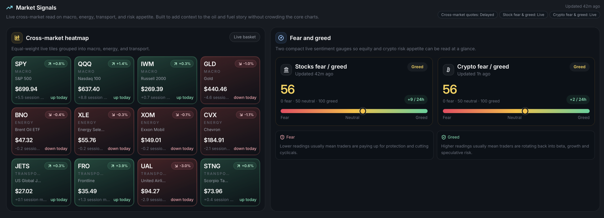
The dashboard tracks two fear-and-greed readings alongside its fuel data: one for equities and one for crypto, both sourced from FearGreedMeter and updated live. As of the time of writing, both sit at 56, in greed territory, having recovered from the extreme-fear readings that defined the early weeks of the crisis.
The fear-and-greed concept is simple. A low reading means traders are paying up for protection, cutting cyclicals, and moving to safety. A high reading means capital is rotating back into risk assets. In the context of a fuel security dashboard, these readings matter because market sentiment around the Strait of Hormuz situation directly influences oil pricing, which feeds through to Australian bowser prices within days.
The Hormuz component is where the dashboard gets genuinely interesting. The Strait of Hormuz is a narrow waterway at the mouth of the Persian Gulf through which roughly 25% of the world’s seaborne oil trade and 20% of its LNG normally passes. Since the conflict began in late February, traffic has fallen to near zero.
The dashboard tracks Polymarket prediction markets on when, and whether, shipping through the Strait normalises. As of 16 April, traders were pricing a 27% chance of more normal Hormuz traffic by end of April, down from a peak of 40% on 23 March. The market-implied reopening date derived from the shipping-recovery basket sits at 29 May. The dashboard renders this as a risk score, combining those market-implied probabilities with the live supply data to give you a single read on how the geopolitical situation is feeding into Australia’s fuel position.
Australia’s exposure here is structural. The country imports roughly 90% of its refined fuel, with around 30% of that refining through Singapore and South Korea, both of which draw on Middle Eastern crude that transits Hormuz. A closed strait doesn’t just affect direct imports, it affects the upstream refining capacity that supplies our ships.
The dashboard’s scenario modelling currently assigns a 10% probability to a declared national liquid fuel emergency. Whether that number moves up or down in coming weeks depends almost entirely on what happens at the Strait.
To use it, head over to NZOilWatch (again, I know it says NZ, but I promise there’s an Australian option), flick over to Australia’s view, and watch the numbers flow like oil used to out of the Strait of Hormuz.